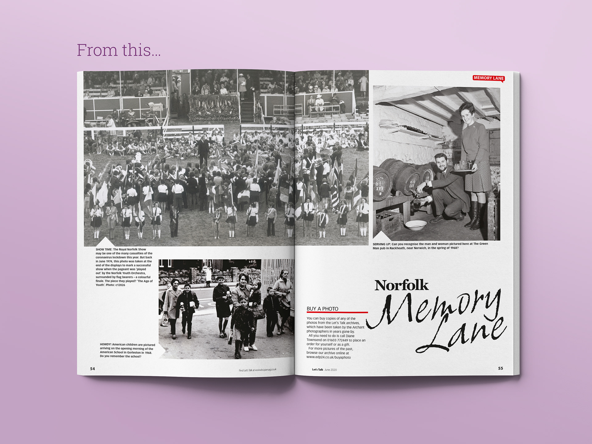
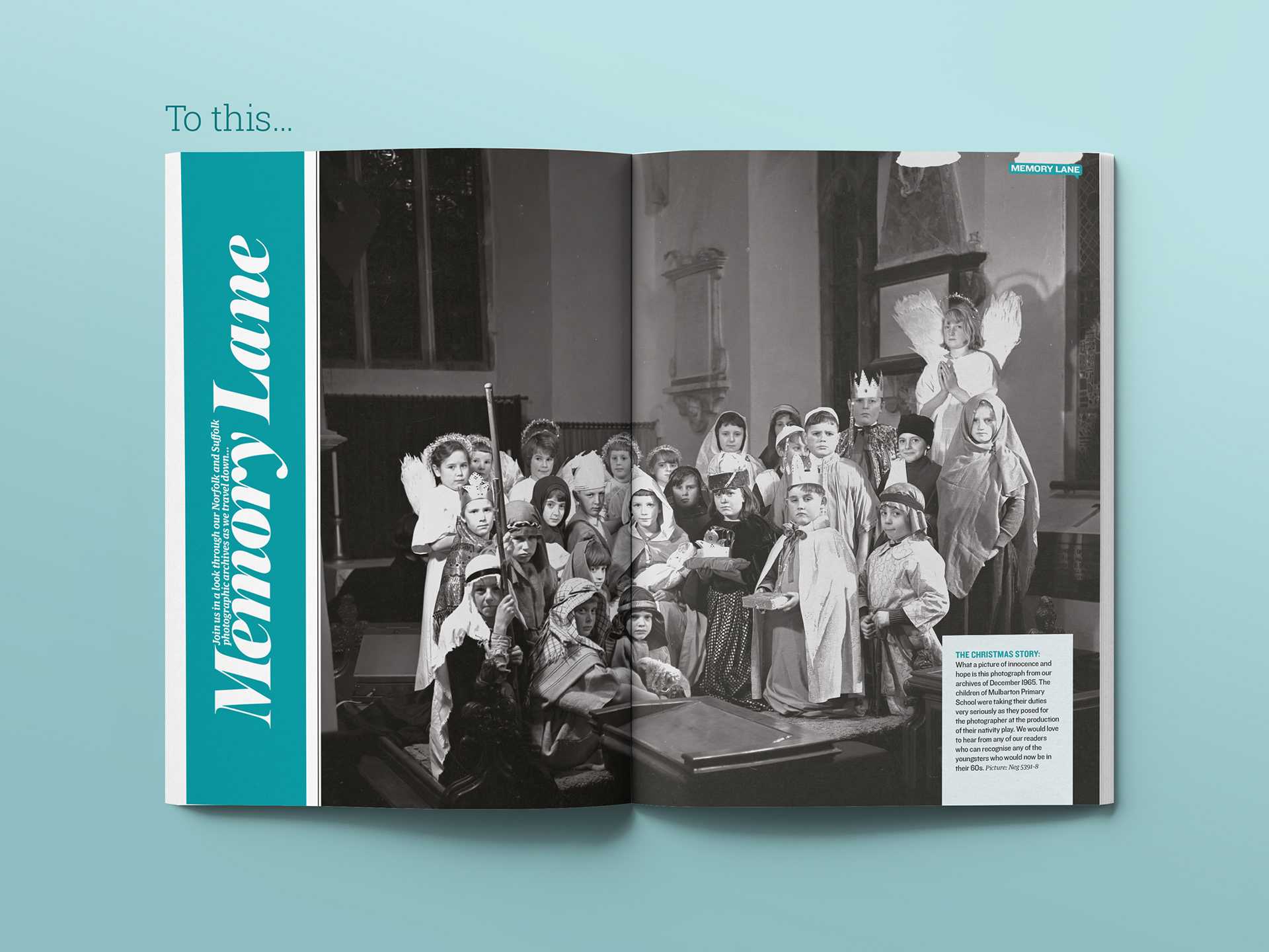
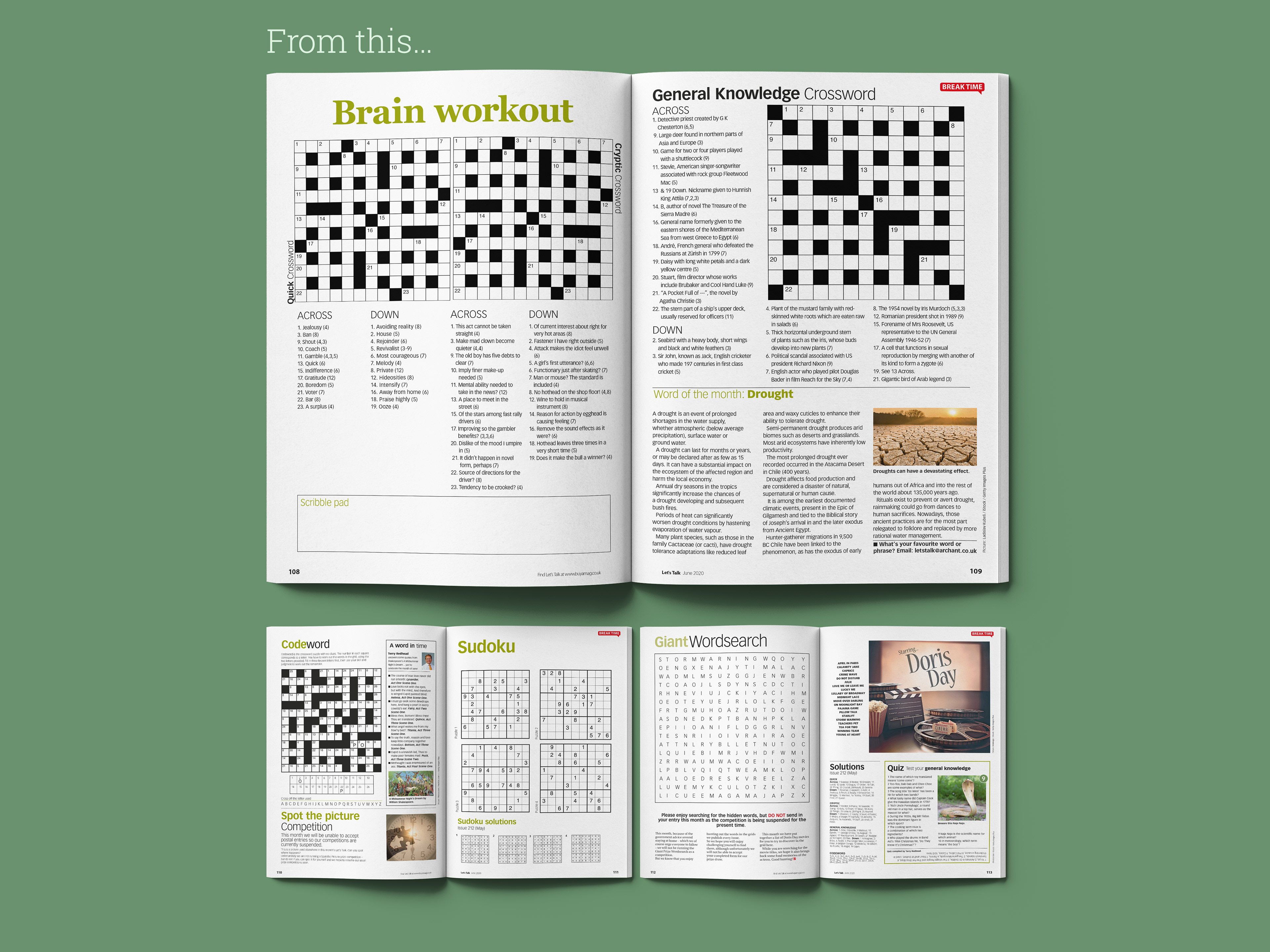
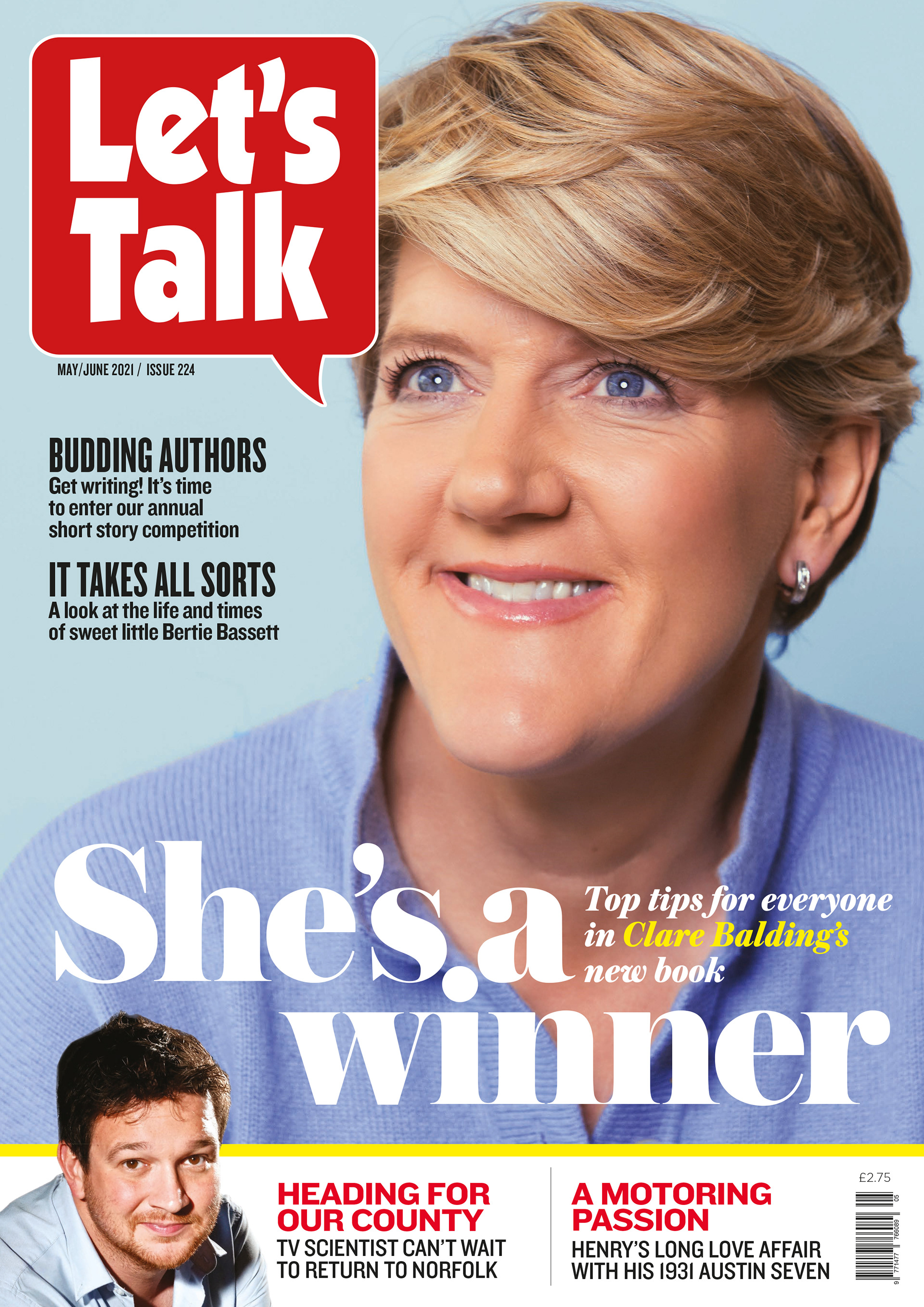
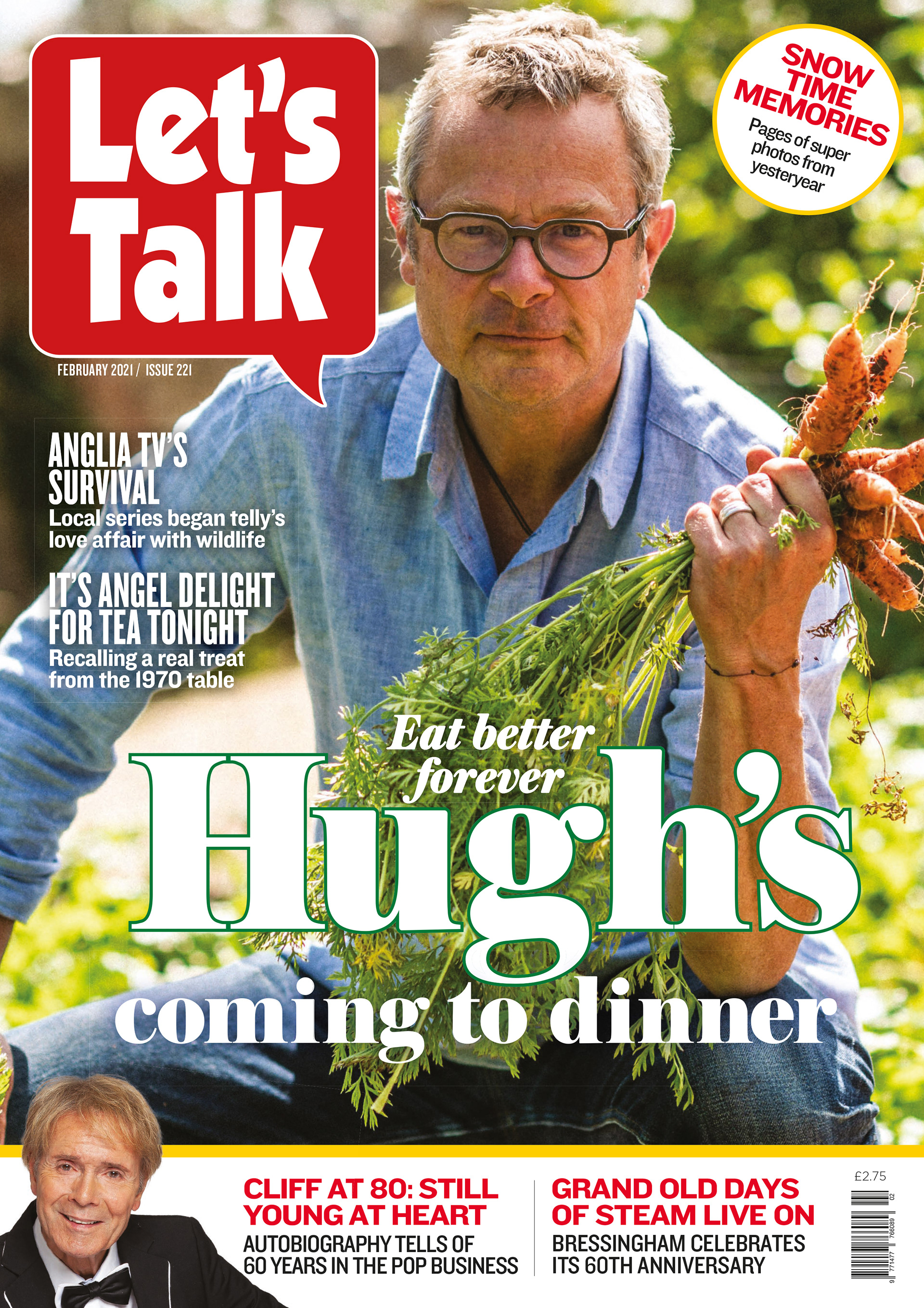
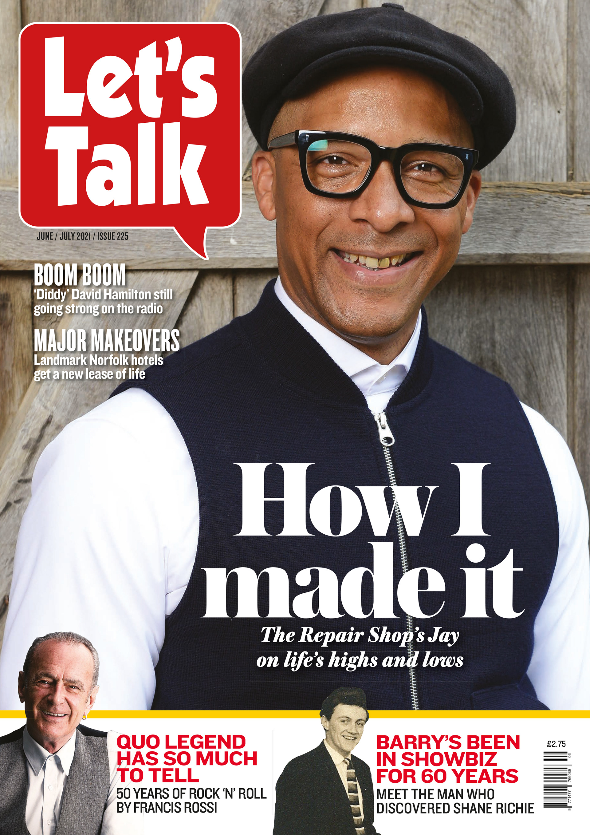
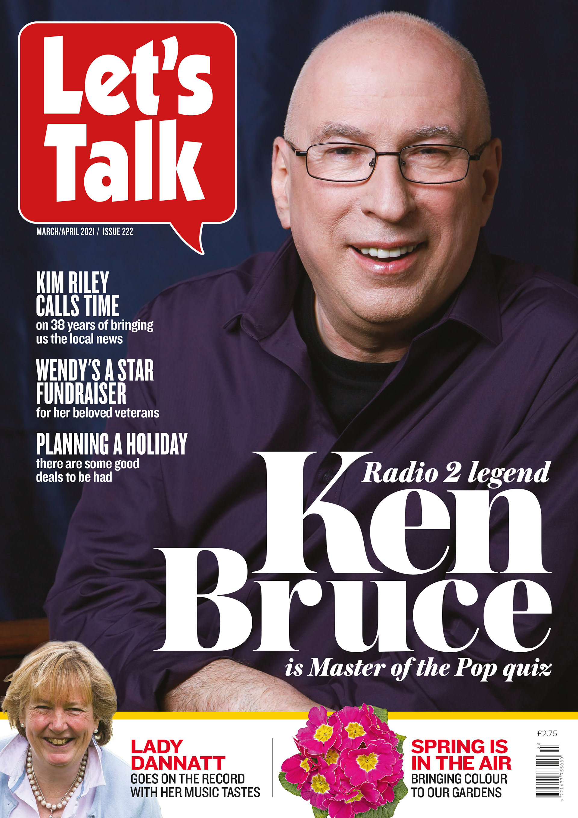
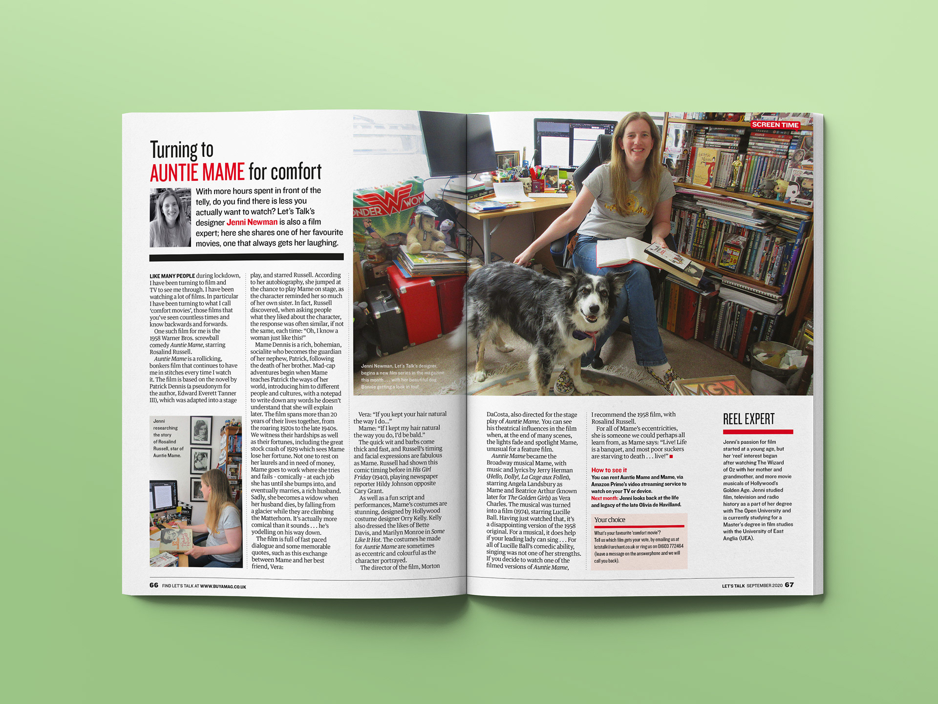
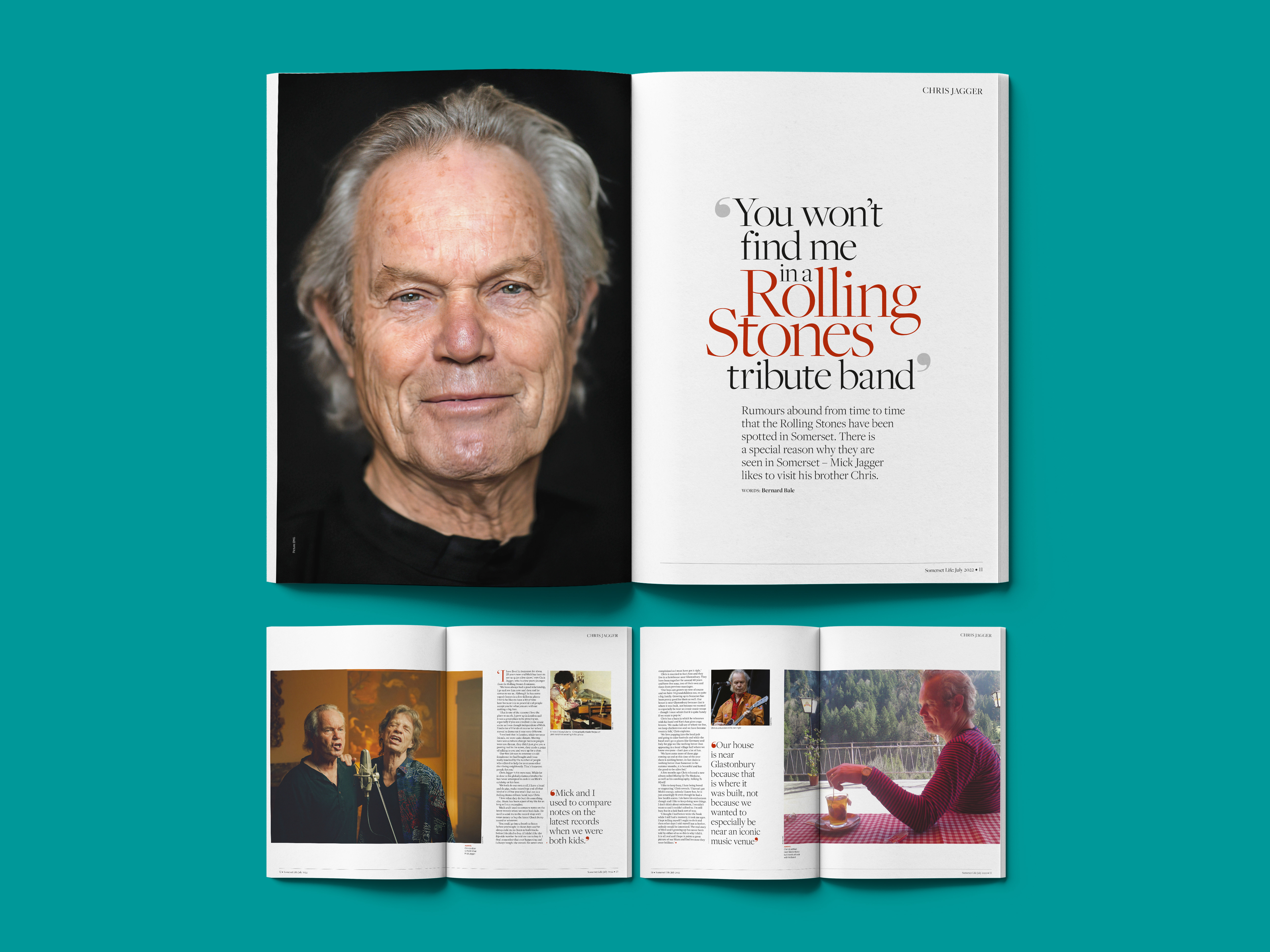
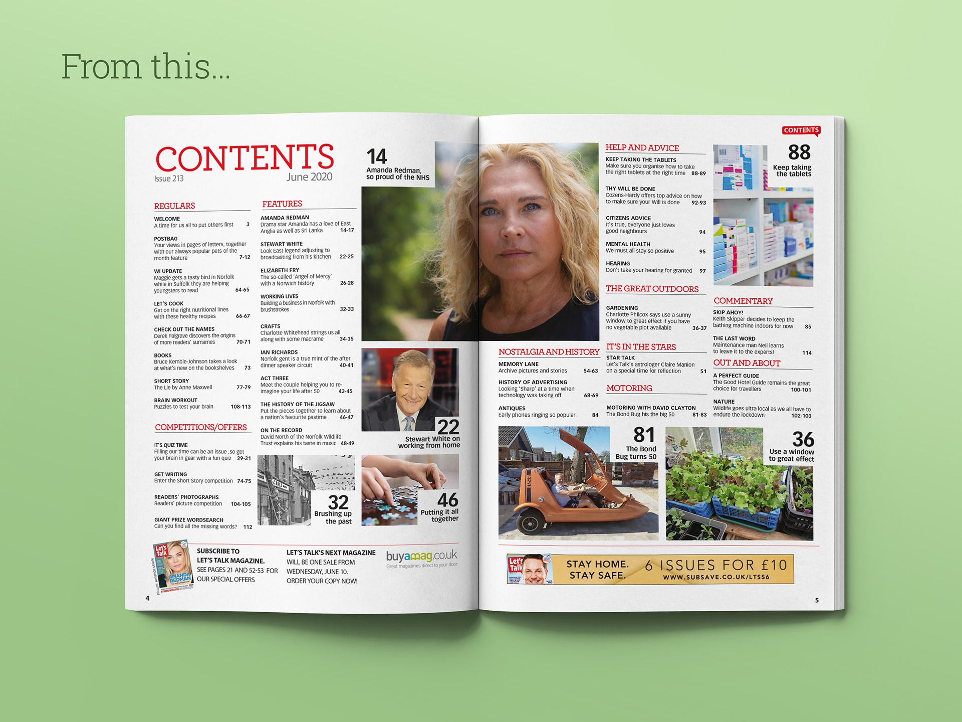
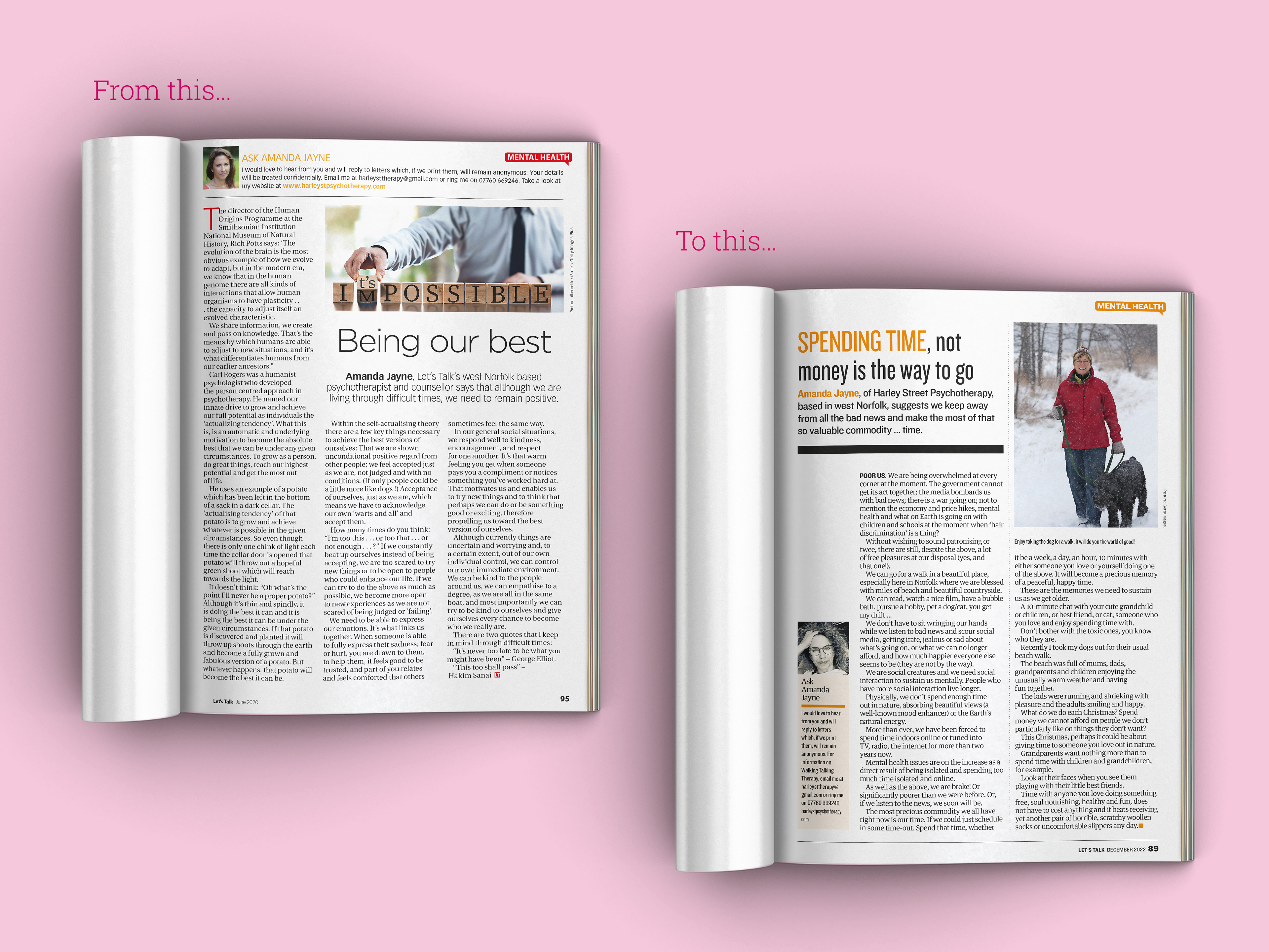
Brief: To re-design regional Let's Talk magazine to refresh its look and update it to match the cover design style. Making sure to keep the the magazines friendly feel and atmosphere whilst producing a modern design for the title. Using more white space, a +1 column design. Choosing new fonts that were still large and strong enough in weight that wouldn't break in print, or cause strain to the reader's eyes. At the forefront of the re-design was to modernise the magazine moving away from its inherited newspaper styled layout design.
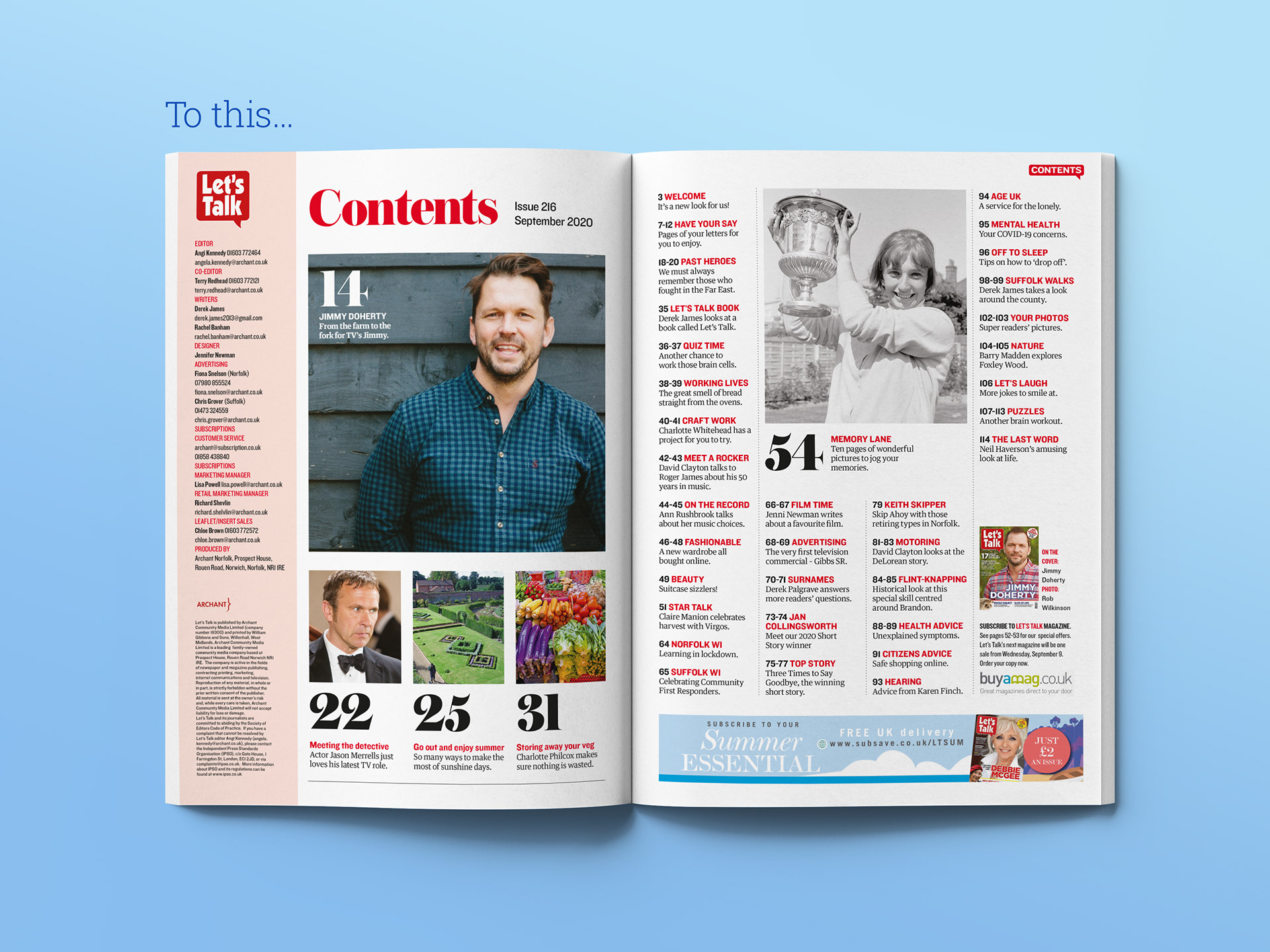
Bolder fonts were chosen after extensive research looking at several different fonts. What was chosen was bolder than its predecessor, a classic serif but also a secondary sans font that had a more modern feel.

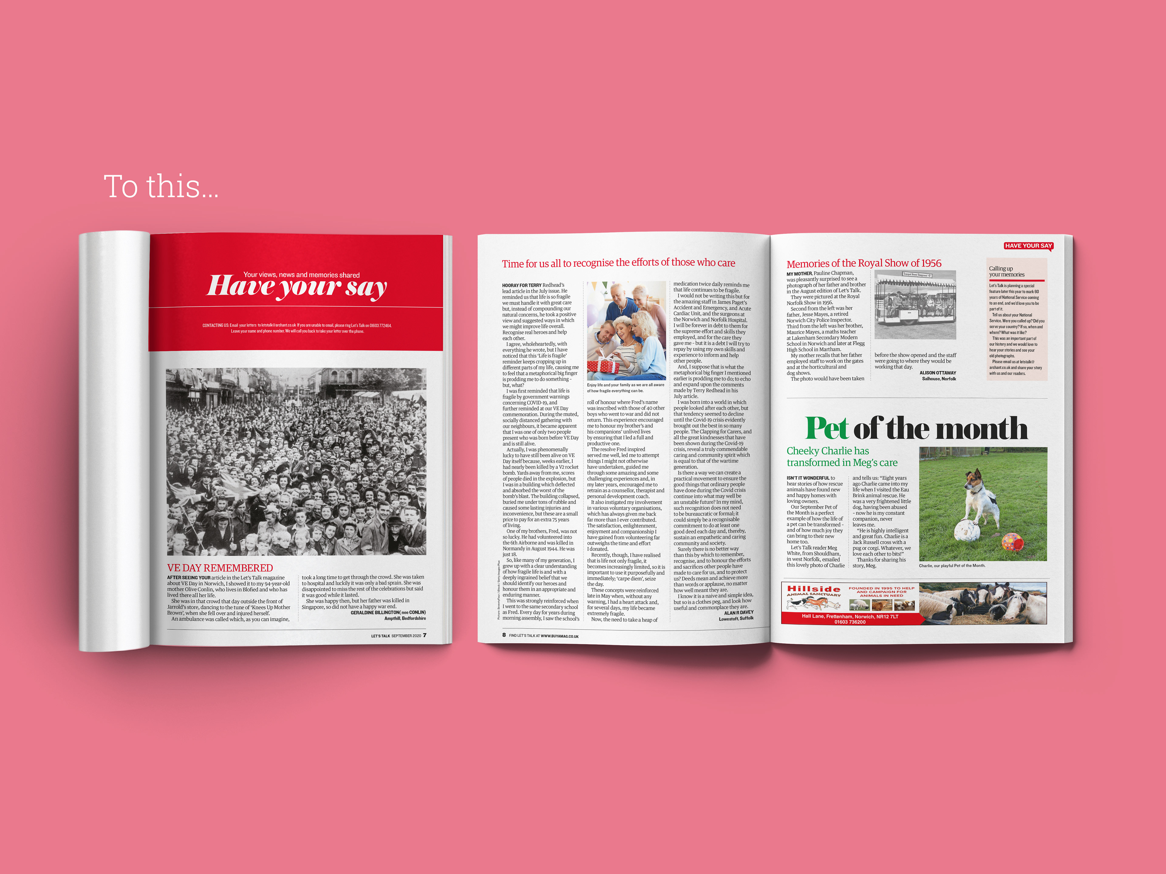
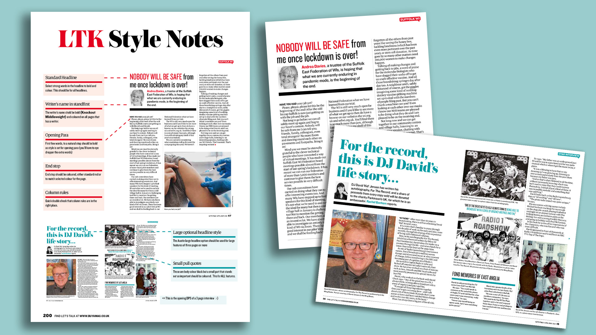
A new page grid was chosen and new layout designs were produced to add more interest to each feature. New styles of pullquotes, panels, a plus one column to allow more white space and better use of the area on the page. Column rules were added to show definition between the columns for better navigation when reading, whilst also giving a pleasingly stylistic look to the pages.
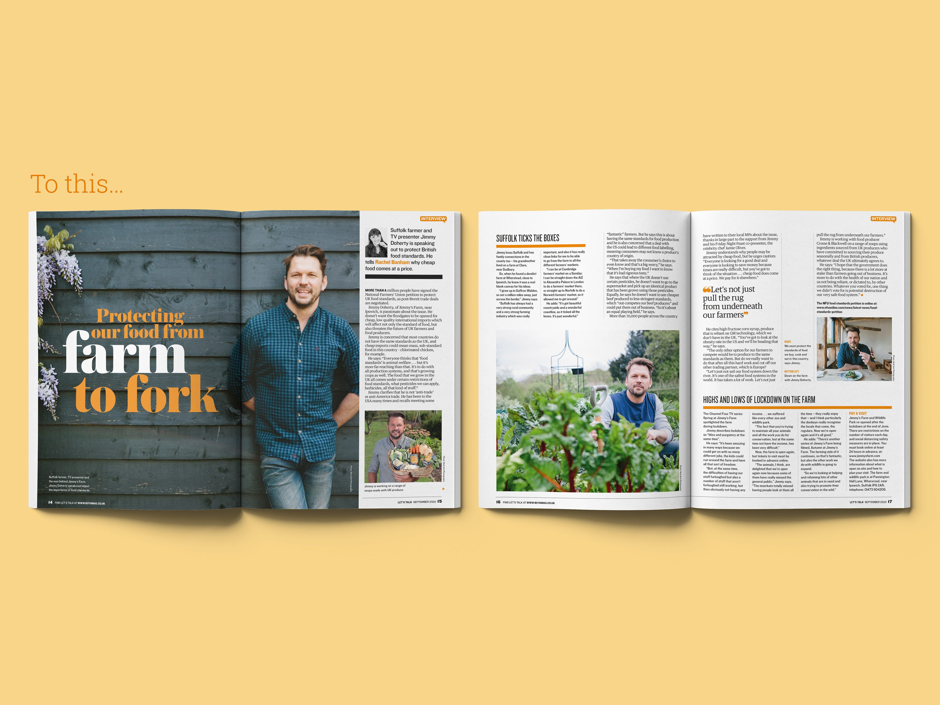
Drop caps were removed in the new re-designed magazine in favour of bolding up and capping the first few pertinent words of the opening sentence. Let's Talk was often an editorial heavy magazine. The altered templates and page grids gave new ways to introduce more white space to pages to allow them to 'breathe' and not feel overcrowded.

Heavy amounts of research and 'mood boards', both physical and digital, were created as points of reference and inspiration for the Let's Talk re-design. All genres of magazines and newspapers were looked at for ideas.
Magazines from across the world were also reviewed, from the genres of sports, travel, art, film, political, food and drink as well as Let's Talk's contemporaries. All were viewed to give inspiration for the re-design.
Magazines from across the world were also reviewed, from the genres of sports, travel, art, film, political, food and drink as well as Let's Talk's contemporaries. All were viewed to give inspiration for the re-design.